Tuesday, March 24, 2009

intro to film final. done.

before i get started on letting you view my final for film...i just want to say...RIP. my iphone. i miss you. :(
and now....here's my final for my film class...it had to be on urban life...but i wanted to make mine on my city...which is NOT urban...it's SUBurban. so, the idea was to make the beginning look like you were in a dirty, grungy city and then, show the beautiful side of sunnyvale. so it's like, you ARE in a CITY, which is what URBAN means..but show both sides, the city part..and then the suburban beatiful...place..i live. so here it is...all still frame shots..song (badly) mixed in garageband...

anyway, off to spend what's left in my bank account on a new iphone. :(
fml

Monday, March 16, 2009

webpages and birthday cards

i think........i'm really horrible about posting on here.
no, i know i am..but i really feel lame when i don't have anything to show. i always just blab (cuz i'm good at it). but today!!!!! TODAY!!!! i do have something to show.
one of our projects in information design was to come up with a new Frequently Asked Questions page for a website (that wasn't designed all that well) on a product we didn't know too much about. you guys can research it more, the product is basically a telephone jack for your computer.....i don't want to single them out for our class having a project revolving around their bad website design/functionality..anyway, here's what i came up with:


so, their real page was really confusing..very engineer inspired with it's technical kind of display (ie. "if your question has to do with this go here----> and if it has to do with that go here ---->) needless to say, it was pretty dumb. so here's my version. idealy there'd be another page that kind of had genres you could choose from but i liked the simplicity of this design. also, i thought the arrow like shape showed 'connecting' (as in connecting one person to another through this device?? eh? eh??) & i know, you might be asking WHY GREEN&PURPLE?! let me tell you!!!! EVERY WEBSITE ON THE INTERNET USES BLUE!!! it's everywhere, and frankly, i'm kind of tired of it..mostly cuz it's always the same shades of blue too..so, i didn't want to use blue since it's EVERYWHERE! so, green and plum was the choice..(which i just so happen to love..) any thoughts?

oh, and here's a quick birthday card i made for my sister's friend named jaqui. my sister drew out a reference of something she wanted it to look like and this is what i came up with for it:

it was just something really cute...my sister asked me for the stars and she put a couple flowers around her name and the 'happy birthday'..but i decided on the starbursts in the background and made the flowers really cutsie..(i'm around fabric enough to know what girlie prints are in..it might even give me the little edge i need in this industry?)
btw, i loved creating this. i'm not great on making really edgy looking things..but i can make something kid friendly/girly really easily...i hope i get a job where i can experiment with all these genres of design. :D i'll stay hopeful.

anyway, that's all for now...two weeks of class left..finals are next week. it's crunch time. i'm sure i'll post my finals up when it's all said and done..we'll see what i come up with.
until next time.
<3 sarah

Monday, March 2, 2009

SJ Gnomee

so this has nothing to do with school..but being a designer..i come from a very crafty/creative background. oh, and...i live like 15 minutes out of san jose..so you better believe the sharks are my fav sports team EVER!! (and they're kickin' butt this year!! woot!) anyway, my family all decided to go to Petroglyph in Willow Glen (its a pottery painting place) about a month or more ago and i picked out a gnome to paint (it's kind of an inside joke with our family...) i was wondering how i wanted to paint him when my dad was like, "he should be wearing a sharks jersey!!" and i'm like...

"GENIUS!!!"

hahahaha!!! so, this little guy has taken me like 3 or 4 trips down to Willow Glen on days off from school...and probably 8+ hours to finish...but here's what he looks like::


and his face/hat::


soo, he is complete..and he's home. i picked him up last night after they had finished firing him. :) i wanted to put him outside (in our backyard next to our other gnome....gnarles...but my mom won't let me.) haha! my parents both agree he kind of looks like Joe Thornton during playoffs when he's growing out his very manly playoff beard. i must agree...he also has a Mike Commodore look to him...cept, without the white-boy fro...and minus the Blue Jackets jersey (blech!)

maybe SJ Gnomee ("no-me") will bring our boys a little luck this playoff season! here's to an amazing finish by our boys in teal!! woot!

Sunday, March 1, 2009

busy busy..just another week.

sooo, it's been incredibly busy these last couple weeks since i've posted last. i actually went on vacation to Arnold, CA to go see the snow! it was amazing. i miss it already. but i did happen to find out when i got back, that our group DID win the obesity timeline project/competition!! here's the winning design:

it wasn't your typical timeline..each patty represents a 5% increase and the color of the french fries represent states with different percentages. under each "combo meal" are facts about how the decade affected the rising numbers in obesity in the US. mike's humor can be seen in the ridiculously funny ads on the top of the menu. overall it was an awesome proj. job well done team!! :D

it was soo exciting to hear we won..but it was probably good i wasn't in class to hear it..cuz i'm a little unruly when it comes to winning/losing things. i'm a sore winner..and an even bigger sore loser. HA! anyway, midterms went pretty well i think...we've moved on to bigger and better things it seems.

Past Projects::
I decided to recap a little..show off some of my stuff i've done so far this quarter..so, this is a project we did in my electronic layout class..took me about two seconds. i just used glyphs from dingbats, wingdings, or webdings..or one of those DING fonts. criteria was just to use two glyphs and make some kind of flyer/postcard::


As a test of just our design skills our teacher had us make a schedule/calendar showing when certain plays were going on at an Opera House in Turkey. all the information was Turkish and had to be translated for us. the object was to have us be unfamiliar with the information...and still showcase it in a way someone would be able to understand. here is what i came up with::


Current Projects::
For video we have to make a short film not using any sound. coming up with a concept was a little hard because we can't talk in it..so we have to get our message across through actions and emotion. our idea was to have a girl go to the store with a shopping list on how to make spaghetti. when she got there she'd go pick out noodles...and in the process just get confused by all the types of noodles. (because, lets face it..you walk into any grocery store and there are not only a million brands of ONE ITEM..there are like a million and one types of it...and picking out something simple then becomes ridiculously confusing and frustrating..am i right?!?!?) so, she'll finally decide on a package of noodles..then walk to the canned tomato sauces and get just as confused...and then she'll drop her bag of noodles..which, as they hit the floor will explode all over the place..and then the last frame would be her running out of the store..like a mad woman. YEA! see, this would be an amazing idea..cept WE'RE NOT ALLOWED TO FILM IN LIKE ANY GROCERY STORE IN TOWN..so we had to change it..and now, we're filming......in a 7-11. wtf? ugh. totally distroys our concept..it made me upset. but, life goes on. we film tomorrow 'round 2...we'll see how it goes.

we have a project for a client (that our teacher had come in..that i probably shouldn't talk about on here...) but has to do with internet privacy. i also have a movie poster project where i have to use type as some sort of texture...then draw up sketches for an intro for the movie using moving type in adobe After Effects (which, as i use more and more..just becomes cooler and cooooooler to play with!!). none of this is too particularly exciting to me..but we'll see how this next week goes.

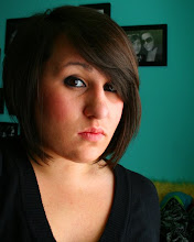
btw, here's a funny pic of me that my best friend lindsay took of me when i was video chatting with her during class....early...in the morning...when i'm still tired.....and want to go back to bed.....(when i probably should've been paying attention..HA!)
for your laughing pleasure::Random thought of the day:
happy late Fat Tuesday...(we celebrated it today at my grandma's house! :D)

oh! one last thing..my random thought of the day last week wasn't suppose to mean THIS SITE..as in MY BLOG SITE...it was suppose to link you HERE!!! but once again, i warn you..don't read it in class...or when someone is talking to you about anything serious..

Thursday, February 12, 2009

Group Project Relief -- I <3 Art School

woo hoo!! so, the group project is over. & i think it's time to celebrate (no joke, our group talked about going out for drinks...as soon as gretch turns 21 that is..monday, woot!)
i really shouldn't complain about this project. i didn't have to do any of the actual design work myself --everyone had input on the ideas and we helped mike make the changes we saw fit...but i actually never touched adobe photoshop or illustrator for this project at all. (it was just the way the work was divided amongst the four of us) but oh, thank god all that damn research on obesity is ooovvvvvveeeeeeerrrrrr. seriously, i almost hate google searches now..there's not really too much i can rely on being factual or legit information. and my teacher brought up a good point..we could have gone and looked at other resources..like a library. (what are those again?) it just didn't occur to me that i'd find the information i needed there.

anyway, we had two judges come in and critique our project...and not only that but we were being judged on our presentation skills as well. thank god michelle, in our group, is great at speaking in front of people..i am too, when i feel comfortable (in this case i did). so it was easy for our group to present..and the judges really had no criticism for our project. they loved it. i think it was very successful. and like i mentioned in a previous post..this was a competition. we don't know who's won just yet but our teacher told us that after the two judges (two faculty members) left that she was really proud to say we were her class. and that everyone was getting an A on the project but the winning team would get an extra prize..which we learned would only be like 5 extra credit points..but i suggested drinks or something..........you know, since we were put through soo much stress for this thing?? :D she laughed...

i love how close the web design students have gotten and how we've developed relationships with our professors --who seem more like coworkers or brainstorming leaders...or something else really...to us than teachers. they've all been really helpful at helping us show our strengths that have to do directly with our majors.
well, on to the next projects/midterms at hand next week. ugh.

Random Thought of the Day (RTD):: don't read this website while you're in class and the teacher's talking...it'll sound like you're laughing at them. :D

Tuesday, February 10, 2009

"flip book" film project idea

heeeellllllllloooooo.
So, i'm sitting here in class (btw, NOT in my own spot, because that's what i get for coming in late and having this girl who doesn't know the rest of the class...come in and take my spot...:( ) anyway, i just presented my idea for my "flip book". Basically what we had to do was come up with a concept for a video for the school's Urban Life art show that's coming up in March. (This is a class assignment, our teacher just wants us to show off our skills we've learned in the class by having something to submit in the art show. and it helps cuz the art show already has a theme.)
My concept starts off with an alarm clock showing 5am, and the light switch being turned on in a room, a woman is getting ready for work in the mirror. then there will be some transition, i'm not sure how just yet, but then it will show downtown san jose during the day. corporate buildings, banks, restaurants, museums, parks..etc. i want to be able to capture what city life is like downtown during the day. --business people, adults, corporate life.
then there will be some other transition and it have a girl getting ready in the mirror, putting her make up on, kind of dressed up to go out on the town. there will be a transition again, probably similar to the previous (of like the woman getting ready --> city buildings, etc) except instead of the city during the day, there will be a series of photos of city night. clubs, bars, pubs, hookah lounges, restaurants. here i will be capturing a different vibe the city gives off at night, how the city attracts specific types of people at different times of the day. the last couple frames will show another alarm clock (at the girls house) showing 5am and the light switch going off..
the concept behind the light switch is this idea of it "flipping on (or off)" different parts of the city during certain parts of the day..i have to develop this concept so it's grasped in the film...
anyway, if anyone has an imput let me knooowwww....i'm still developing this whole..idea.

random thought of the day:
trail mix, like REAL trail mix...not the stuff with m&ms in it..is pure greatness.

Sunday, February 8, 2009

blogger virgin..corrupted

Can you believe i signed up for this site in 2007 and haven't even THOUGHT about posting til recently?! it's kinda crazy.
i'm one of those people that only does things half way. i've tried to be better about it...but lets face it. i am, and probably always will have that slacker lifestyle in me. that's just the way i've always been..well, most of my life. BUT i shouldn't tare myself down on this first day i blog. seriously, since i've been at art school (it's almost been a year now..) i've been on the honor roll every quarter, won a $50 scholarship for a small design competition..art school's kept me on my toes...
oh, btw, i'm sarah. i just turned 21 and i go to the art institute of california --sunnyvale. i'm majoring in web design but love print designing too. i don't know what my plans/goals for this blog are or will be...we'll see as i progress.
i'm currently working on a few projects
-a group project, that's almost complete. we were given information to make into an visually appealing timeline. (seriously? isn't that like, an oxymoron??) anyway, our group (Team A or Team #1) is competition with team LOSER as i call them..haha (team B). The facts are on the growing obesity trends in adults in america. we had no design concept until this past week when i came up with the brilliant idea of making the timeline look like a drive thru fast food menu. GENIUS RIGHT?! i'm not in charge of the design (kind of??) but i was glad my brainstorming idea was a good one. :) we're meeting tomorrow morning to put the presentation together..i'm excited. i don't like to lose. i'm a big, fat, SORE loser...so i'm going to make sure to not lose this thing.
-for film class my teacher wants us to get a personal/professional portfolio site up and running within the next couple weeks. it's been stressful but i just need to put something together already. my ideas are too big for the beginning stages i'm stuck in at the moment. we also have to come up with an idea for a video submission to this art show that will be hosted at our school coming up in march. i haven't thought about it too much. it's on urban life. i've lived in sunnyvale, CA my whole life. the epitome of suburban life..silicon valley...BLAHNESS. i'll have to think about this all a lot more.
those are my two HUGE projects going on at the moment. i feel bad cuz i told a friend i'd get a background made for his video broadcast page, like, TWO weeks ago now?? it's totally been a second thought to all this school work going on..but i want to make it fantastic since it's taken me so long. we'll see what i come up with.
i'll be sure to post some of my design stuff up soon...i don't know how it'll work out...but we'll just have to wait and see...
until next time...
consider this blogger cherry --POPPED. in a big way. HAHAHAHA!! ;)